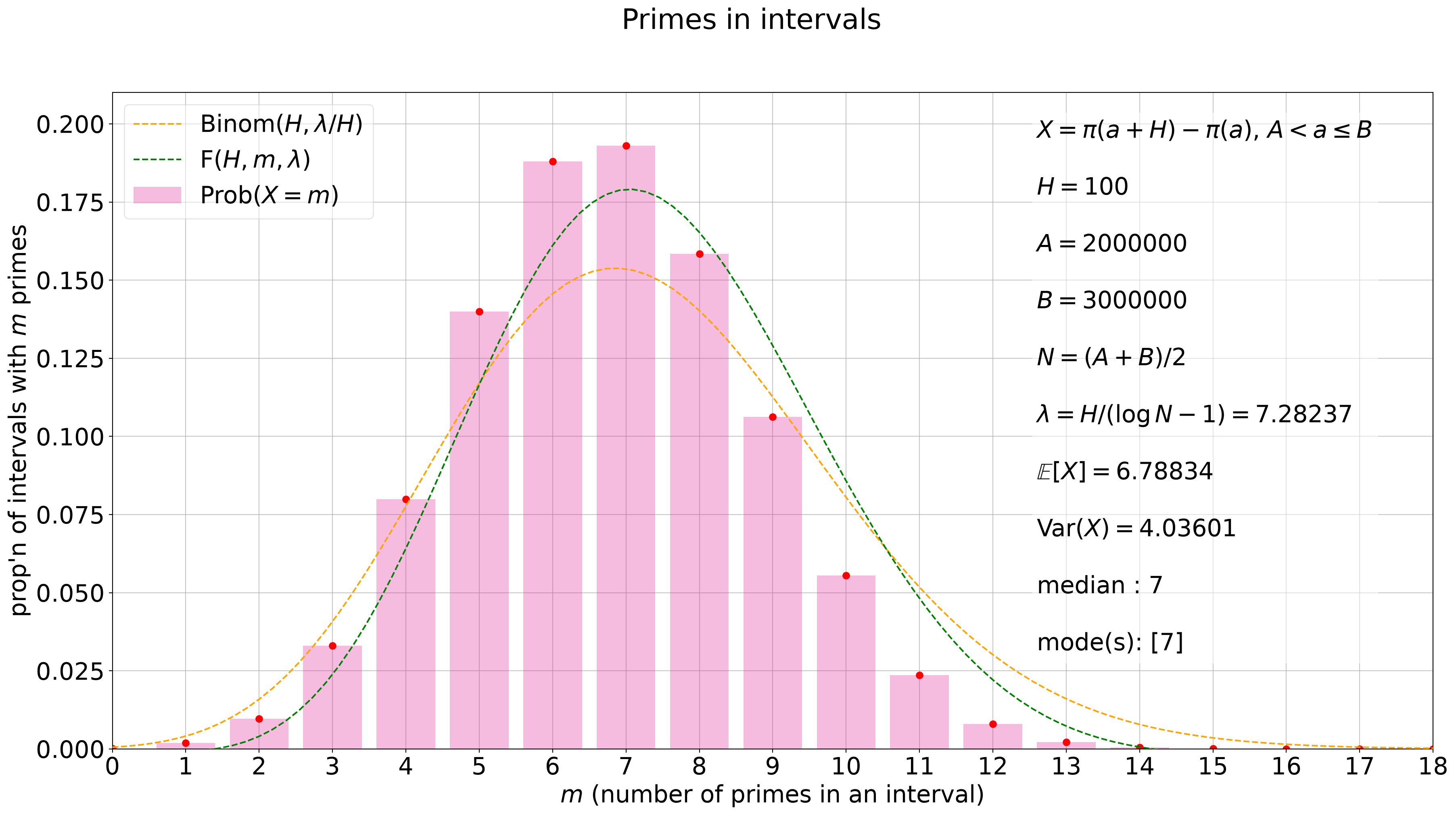
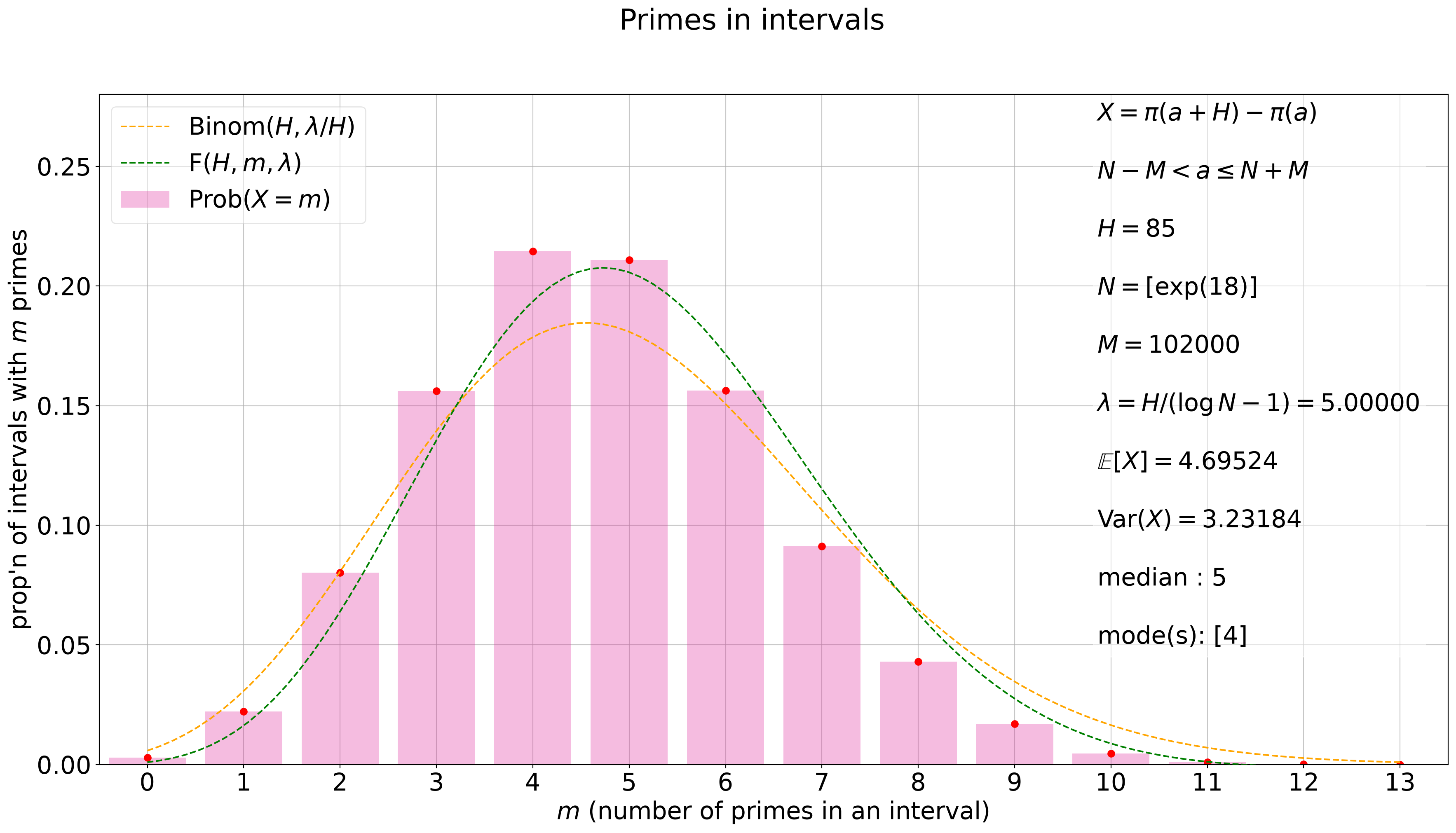
A picture is where the bias becomes visible. The plotting code lives in src/primes_in_intervals/plotting.py (pii plot and pii animate from the shell), and the heart of it is one function, plot_distribution_frame, which draws a single checkpoint’s distribution onto an axis: the data as translucent bars (with a red dot on top of each), the Binomial prediction as a dashed orange curve, and, for overlapping intervals, the prediction \(F\) as a dashed green curve, the smooth curves being exactly why the prediction functions accept real \(m\). A text box overlays the parameters and the summary statistics of the frame, the legend sits in the upper left, and a grid is drawn underneath everything else. The axis is cleared first, so the same function serves as the frame function of an animation: animate_distribution runs it across the checkpoints (skipping the trivial first one), holding the axes fixed so the frames are comparable, and returns the figure and the animation; save_gif and save_mp4 write the result to a file.
Every chapter runs in its own session; the folded cells below rebuild the running datasets of Chapter 4 and apply analyze to each, which is all the plots need.
Setup: rebuild the running datasets from the database
import numpy as np# NumPy 2 displays scalars inside containers as np.float64(...); restore the# plain numeric display so statistics read cleanly.np.set_printoptions(legacy="1.25")from primes_in_intervals import nest, partition, retrievedef pick(found, lower_bound):"""Return the retrieved dataset whose data begins at the given lower bound. Introduced in the Datasets chapter: accepts either return shape of ``retrieve`` (one dataset, or a list of them). """ifisinstance(found, dict): found = [found]returnnext(d for d in found if d['header']['lower_bound'] == lower_bound)# Example 1: interval length 100 over (2 * 10**6, 3 * 10**6].A1, B1, H1 =2*10**6, 3*10**6, 100retrieve_data1disj = retrieve(H1, 'disjoint')retrieve_data1olap = pick(retrieve(H1, 'overlap'), A1)partition(retrieve_data1disj)partition(retrieve_data1olap)nest_data1disj = nest(retrieve(H1, 'disjoint'))nest_data1olap = nest(pick(retrieve(H1, 'overlap'), A1))# Example 2: interval length 85 about exp(18), and the companion length-90# datasets used for nesting.N2, H2 =int(np.exp(18)), 85retrieve_data2disj = retrieve(H2, 'disjoint')retrieve_data2olap = retrieve(H2, 'overlap')partition(retrieve_data2disj)partition(retrieve_data2olap)nest_data2disj = nest(retrieve(90, 'disjoint'))nest_data2olap = nest(pick(retrieve(90, 'overlap'), 65559979))
Setup: analyze the running datasets
from primes_in_intervals import analyzefor _ds in (retrieve_data1disj, retrieve_data1olap, retrieve_data2disj, retrieve_data2olap, nest_data1disj, nest_data1olap, nest_data2disj, nest_data2olap): analyze(_ds)
Example 1
The final frame for the overlapping intervals of Example 1: a hundred intervals’ worth of data between two and three million, \(H = 100\).
The distribution hugs its center more tightly than the Binomial curve allows, and the green curve follows it: the bias of the book’s title, on real data.
Example 2
The final frame for Example 2’s overlapping intervals about \(e^{18}\), \(H = 85\). This frame’s text box, as in the original figure, states the range in its centered form, \(N - M < a \le N + M\) with \(N = [\exp(18)]\), so we pass the overlay as a literal string.
import numpy as npX = retrieve_data2olapA = X['header']['lower_bound']H = X['header']['interval_length']C =list(X['distribution'].keys())B = C[-1]N = (A + B)/2p =1/(np.log(N) -1)mu = X['statistics'][B]['mean']sigma = X['statistics'][B]['var']med = X['statistics'][B]['med']if med ==int(med): med =int(med)modes = X['statistics'][B]['mode']overlay_text = (fr'$X = \pi(a + H) - \pi(a)$'+'\n\n'+fr'$N - M < a \leq N + M$'+'\n\n'+fr'$H = {H}$'+'\n\n'+fr'$N = [\exp(18)]$'+'\n\n'+fr'$M = {B -int(np.exp(18))}$'+'\n\n'+fr'$\lambda = H/(\log N - 1) = {H*p:.5f}$'+'\n\n'+r'$\mathbb{E}[X] = $'+f'{mu:.5f}'+'\n\n'+r'$\mathrm{Var}(X) = $'+f'{sigma:.5f}'+'\n\n'+fr'median : ${med}$'+'\n\n'+fr'mode(s): ${modes}$')fig, ax = plt.subplots(figsize=(22, 11))fig.suptitle('Primes in intervals')plot_distribution_frame(ax, X, B, overlay=overlay_text, overlay_position=(0.74, 0.18))plt.show()
The full animations step through every checkpoint of these figures, the sample growing frame by frame; they are produced with animate_distribution followed by save_gif or save_mp4, or in one line from the shell with pii animate. The worked examples to come lean on them.
Source Code
# Plot & animate {#sec-plot}A picture is where the bias becomes visible. The plotting code lives in `src/primes_in_intervals/plotting.py` (`pii plot` and `pii animate` from the shell), and the heart of it is one function, `plot_distribution_frame`, which draws a single checkpoint's distribution onto an axis: the data as translucent bars (with a red dot on top of each), the Binomial prediction as a dashed orange curve, and, for overlapping intervals, the prediction $F$ as a dashed green curve, the smooth curves being exactly why the prediction functions accept real $m$. A text box overlays the parameters and the summary statistics of the frame, the legend sits in the upper left, and a grid is drawn underneath everything else. The axis is cleared first, so the same function serves as the frame function of an animation: `animate_distribution` runs it across the checkpoints (skipping the trivial first one), holding the axes fixed so the frames are comparable, and returns the figure and the animation; `save_gif` and `save_mp4` write the result to a file.Every chapter runs in its own session; the folded cells below rebuild the running datasets of @sec-raw_data and apply `analyze` to each, which is all the plots need.{{< include _setup_analyzed.qmd >}}### Example 1 {#sec-eg1plot}The final frame for the overlapping intervals of Example 1: a hundred intervals' worth of data between two and three million, $H = 100$.```{python}import matplotlib.pyplot as pltfrom primes_in_intervals import plot_distribution_frameX = retrieve_data1olapC =list(X['distribution'].keys())plt.rcParams.update({'font.size': 22})fig, ax = plt.subplots(figsize=(22, 11))fig.suptitle('Primes in intervals')plot_distribution_frame(ax, X, C[-1], x_pad=0)plt.rcParams['savefig.facecolor'] ='white'plt.show()```The distribution hugs its center more tightly than the Binomial curve allows, and the green curve follows it: the bias of the book's title, on real data.### Example 2 {#sec-eg2plot}The final frame for Example 2's overlapping intervals about $e^{18}$, $H = 85$. This frame's text box, as in the original figure, states the range in its centered form, $N - M < a \le N + M$ with $N = [\exp(18)]$, so we pass the overlay as a literal string.```{python}import numpy as npX = retrieve_data2olapA = X['header']['lower_bound']H = X['header']['interval_length']C =list(X['distribution'].keys())B = C[-1]N = (A + B)/2p =1/(np.log(N) -1)mu = X['statistics'][B]['mean']sigma = X['statistics'][B]['var']med = X['statistics'][B]['med']if med ==int(med): med =int(med)modes = X['statistics'][B]['mode']overlay_text = (fr'$X = \pi(a + H) - \pi(a)$'+'\n\n'+fr'$N - M < a \leq N + M$'+'\n\n'+fr'$H = {H}$'+'\n\n'+fr'$N = [\exp(18)]$'+'\n\n'+fr'$M = {B -int(np.exp(18))}$'+'\n\n'+fr'$\lambda = H/(\log N - 1) = {H*p:.5f}$'+'\n\n'+r'$\mathbb{E}[X] = $'+f'{mu:.5f}'+'\n\n'+r'$\mathrm{Var}(X) = $'+f'{sigma:.5f}'+'\n\n'+fr'median : ${med}$'+'\n\n'+fr'mode(s): ${modes}$')fig, ax = plt.subplots(figsize=(22, 11))fig.suptitle('Primes in intervals')plot_distribution_frame(ax, X, B, overlay=overlay_text, overlay_position=(0.74, 0.18))plt.show()```The full animations step through every checkpoint of these figures, the sample growing frame by frame; they are produced with `animate_distribution` followed by `save_gif` or `save_mp4`, or in one line from the shell with `pii animate`. The worked examples to come lean on them.