We will now visualise our data in various ways. For each visualisation, we explain the goal and give a sample frame from the animation in question; for the two distribution animations, we also embed the finished GIF. The code behind the figures is in the package: the calculations (error terms and curve fits) in src/euclid_analysis/analysis.py, and the figure and animation builders in src/euclid_analysis/plotting.py. We describe both as we go. (Generating the animations from the raw data takes a few minutes in some cases.)
9.1 One-dimensional analysis: distribution
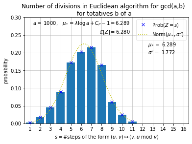
We now generate an animation consisting of a sequence of frames like the one below.
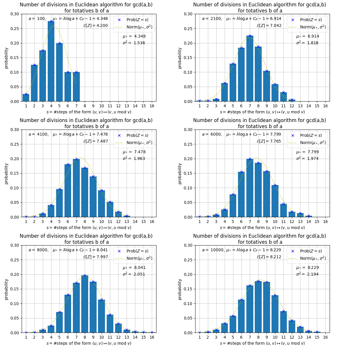
This frame corresponds to \(a = 1000\). Our animation will show 100 frames, corresponding to \(a = 100, 200, \ldots, 10000\). Recall that for a given \(a\), \(Z\) is a random variable whose value at \(b\) (chosen uniformly at random from among the totatives of \(a\), i.e. from \(\mathbb{Z}_a^{\times}\)), is \(T(a,b)\). The horizontal axis shows the possible values \(s\) that \(Z\) may take (over all \(a\) in our sequence). The histogram shows the probability that \(Z = s\), i.e.
We also see the value of \(\mathbb{E}[Z]\) and the estimate \(\mu_* = \lambda \log a + C_P - 1\) given by Porter’s theorem (Theorem 5.1), both truncated three places after the decimal point. As we will see, there is usually agreement between the two values up to one or two decimal places.
We also show the variance \(\sigma^2\) of \(Z\), and a curve showing the PDF for the normal distribution with mean \(\mu_*\) and variance \(\sigma^2\). For most \(a\) in our animation sequence, it would seem that the distribution of \(Z\) is reasonably well-approximated by this normal distribution, i.e. for most \(s\),
where “error” is “small”. Such a result, even if we could precisely formulate and prove it, would be somewhat otiose without a good estimate for \(\sigma\).
Here is the finished animation.
The frames are drawn by plot_one_dim_distribution_frame and assembled by animate_one_dim_distribution in plotting.py, working from the loaded H1 data: common axes are fixed across all frames so the picture does not jump around, and each frame shows the histogram of \(Z\), the points \(\mathbb{P}(Z = s)\), and the density of \(\mathrm{Norm}(\mu_*, \sigma^2)\), with \(\mu_*\) from Porter’s theorem and \(\sigma^2\) the empirical variance (no theoretical estimate for the variance being available). save_gif writes the animation to images/.
9.2 One-dimensional analysis: mean and error term
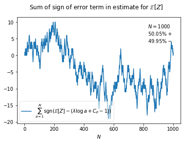
We now generate an animation consisting of a sequence of frames like the one below.
This frame corresponds to \(N = 1000\). Our animation will show 2000 frames, corresponding to \(N = 1, 2, \ldots, 2000\). Recall that for a given \(a\), \(Z\) is a random variable whose value at \(b\) (chosen uniformly at random from among the totatives of \(a\), i.e. from \(\mathbb{Z}_a^{\times}\)), is \(T(a,b)\). Porter’s theorem (Theorem 5.1) gives a very precise estimate for \(\mathbb{E}[Z]\), which is equivalent to
for all \(a \ge 1\) and any \(\epsilon > 0\). We believe \(Z\) behaves roughly like a normal random variable, and so we would expect the error term in Porter’s result (i.e. the left-hand side of the above bound), to be positive for about half of all values of \(a\) up to \(N\), for all large \(N\).
Thus, if we consider the sum of the sign of the error term, i.e.
we expect this to behave like the distance from the origin in a one-dimensional random walk, after \(N\) steps, where at each step, the probability of moving right is \(1/2\), and the probability of moving left is \(1/2\). Thus, the value of the above sum should be equal to zero for infinitely many \(N\), and so on.
The frame corresponding to \(N\) in our animation shows \(1,2,\ldots,N\) on the horizontal axis, and above each of these points it shows the value of the above sum. The animation does appear to be consistent with the random walk analogy.
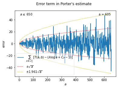
We also produce a second animation in relation to the error term in Porter’s theorem. Recall Conjecture 5.1, effectively asserting that \(1/6\) can be replaced by \(1/2\) in the \(O\)-term exponent in Porter’s theorem. Equivalently, for all \(a \ge 1\) and any \(\epsilon > 0\),
This is illustrated in a sequence of plots corresponding to \(a \le 1,2,\ldots,2000\). Below is the frame corresponding to \(a \le 650\).
The horizontal axis shows \(1,2,\ldots,650\), and above each point the value of \(\mathcal{E}(a)\) is plotted. We also see the parabolas \(y = \pm \sqrt{a}\) and \(y = \pm c\sqrt{a}\), where \(c\) is just large enough so that this parabola contains the graph \(y = \mathcal{E}(a)\). We also note points like \(a = 605\): this gives the maximum value \(\mathcal{E}(a)/\sqrt{a}\) for \(1 \le a \le 650\).
In the data for \(a\) up to \(2000\), it would certainly seem that \(\mathcal{E}(a)\) grows not much faster than \(\sqrt{a}\).
The calculations behind these two animations are in analysis.py. porter_error computes \(\mathcal{E}(a)\) for a single \(a\) directly from the frequency data, and porter_error_series assembles the whole map \(\{a : \mathcal{E}(a)\}\). sign_summary takes that series and produces the random-walk quantities: the running counts of positive and negative signs, their proportions (the percentages shown in the corner of each frame), and the running sum \(\sum_{a \le N} \mathrm{sgn}\,\mathcal{E}(a)\) that the first animation plots. For the second, error_champions scans \(\mathcal{E}(a)/\sqrt{a}\) and records every \(a\) at which the running maximum or minimum jumps; the largest record in absolute value up to a given point is the constant \(c\) in the bounding parabolas \(\pm c\sqrt{a}\), and it is the champions (\(a = 605\) among them) that the frames label. The corresponding frames are drawn by plot_porter_sign_sum_frame and plot_porter_error_frame in plotting.py.
9.3 One-dimensional analysis: variance
We now generate an animation consisting of a sequence of frames like the one below.
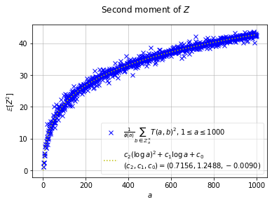
This frame corresponds to \(N = 1000\). Our animation will show 100 frames, corresponding to \(N = 100, 200, \ldots, 10000\). Recall that for a given \(a\), \(Z\) is a random variable whose value at \(b\) (chosen uniformly at random from among the totatives of \(a\), i.e. from \(\mathbb{Z}_a^{\times}\)), is \(T(a,b)\). The variance of \(Z\) is thus
Although Porter’s theorem (Theorem 5.1) gives a very precise estimate for \(\mathbb{E}[Z]\), namely \(\mathbb{E}[Z] = \lambda \log a + C_P - 1 + O_{\epsilon}(a^{\epsilon - 1/6})\), a precise estimate for \(\mathrm{Var}(Z)\) has not been established.
of \(Z\). We suspect that this is reasonably well-approximated by \(c_2(\log a)^2 + c_1 \log a + c_0\) for certain constants \(c_2,c_1,c_0\).
In the plot above, the horizontal axis shows \(a\)-values for \(1 \le a \le N\), and above each such point we plot the value of \(\mathbb{E}[Z^2]\). We also plot the best-fitting curve of the form \(c_2(\log a)^2 + c_1 \log a + c_0\) to the data shown in the plot, and display \(c_2,c_1,c_0\), truncated at the fourth decimal place.
The curve certainly seems to have the right rate of growth, but \(\mathbb{E}[Z^2]\) seems to oscillate quite widely around it, possibly because the \(a\)-values we are considering are fairly small. Notice that, in the above plot, \(c_2 \approx 0.71\), and that \(\lambda^2 = 0.7102543\ldots\) (see (4.4)). Coincidence? We think not. In fact, by Porter’s theorem we have
As we noted, \(\lambda^2 = 0.7102543\ldots\). If we curve-fit the data for \(\mathbb{E}[Z^2]\) with \(\lambda^2(\log a)^2 + c_1\log a + c_0\), we get values for \(c_1\) that are fairly close to \(\eta + 2\lambda(C_P - 1) = 1.3033\ldots\). (See (4.7) for Hensley’s constant, which arises in the variance in the two-dimensional analysis.)
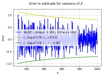
In conclusion, we suspect that \(\mathrm{Var}(Z) = \eta\log a + \mathrm{constant} + \mathrm{error}\), where \(\mathrm{error} \ll_{\epsilon} a^{\epsilon - 1/2}\) (but the error term dominates \(\mathrm{constant}\) for \(a\) in the range we are considering here). The \(\mathrm{constant}\) appears to be around \(-0.3\). Below is a plot of \(\mathrm{Var}(Z) - (\eta\log a - 0.354)\) for \(100 \le a \le 1000\). Also, the plot shows bounding curves growing like \((\log a)^2a^{-1/2}\). We’ll animate a sequence of such plots, corresponding to \(100 \le a \le N\) for \(N = 1000,1100,\ldots,10000\).
Here the curve fitting is the point. second_moment_model in analysis.py is the ansatz \(c_2(\log a)^2 + c_1\log a + c_0\), and fit_second_moment fits it to the empirical second moments with scipy.optimize.curve_fit over a chosen range of \(a\); each frame of the first animation refits on the data up to its \(N\) and displays the fitted \((c_2, c_1, c_0)\), and it is this fit that keeps returning \(c_2 \approx 0.71 \approx \lambda^2\). For the second animation, variance_guess_error forms the residuals \(\mathrm{Var}(Z) - (\eta\log a + \mathrm{constant})\), the constant defaulting to \(-0.354293955\), the value obtained from a line of best fit done separately from this document; the bounding curves \(c_{\pm}(\log a)^2/\sqrt{a}\) take \(c_{\pm}\) just large enough to contain the data. The frames are drawn by plot_second_moment_frame and plot_variance_error_frame.
9.4 Two-dimensional analysis: error terms & subdominant constant in the variance
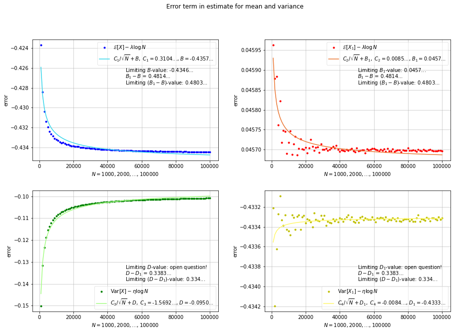
We now generate an animation from a sequence of frames, one of which is shown below. Each frame contains four plots: the two plots on the left correspond to the random variable \(X\), while the two on the right correspond to \(X_1\). Recall that \(X\) gives the value of \(T(a,b)\), for \((a,b)\) chosen uniformly at random from ordered pairs with \(1 \le b < a \le N\), and that \(X_1\) is defined similarly, but with the restriction that \(\gcd(a,b) = 1\).
Norton’s theorem (Theorem 6.1) tells us that \(\mathbb{E}[X] - \lambda \log N = \nu - \frac{1}{2} + O_{\epsilon}(N^{\epsilon - 1/6})\), and, equivalently (see Proposition 6.1), that \(\mathbb{E}[X_1] - \lambda\log N = \nu_1 - \frac{1}{2} + O_{\epsilon}(N^{\epsilon - 1/6})\). (See (4.4) and (4.6) for the constants.) If Conjecture 5.1 is true, \(1/6\) can be replaced by \(1/2\) in the exponent of each \(O\)-term here. In the top two plots below, we see \(\mathbb{E}[X] - \lambda\log N\) (left) and \(\mathbb{E}[X_1] - \lambda \log N\) (right) for \(N = 1000,2000,\ldots,100000\) (horizontal axis). We curve-fit each set of points to curves \(B + C_1/\sqrt{N}\) (left) and \(B_1 + C_2/\sqrt{N}\) (right). These curves certainly seem to be of the right “shape”, supporting the conjecture of “square-root cancellation”. Moreover, \(B\) should be close to \(\nu - \frac{1}{2} = -0.4346485\ldots\), and \(B_1\) should be close to \(\nu_1 - \frac{1}{2} = 0.0456951\ldots\). Also, \(B_1 - B\) should be close to \(\nu_1 - \nu = 0.4803436\ldots\), as shown in Proposition 6.1. Indeed, as displayed in the plot below, \(B = -0.4357\ldots\), \(B_1 = 0.0457\ldots\), and \(B_1 - B = 0.4803\ldots\)
The bottom two plots are analogous, but for the variances of \(X\) and \(X_1\). These are also more interesting, because we don’t really know what the “subdominant” constants should be. That is, by the theorem of Baladi and Vallée (?thm-BalVal), we know that there exist constants \(\kappa\) and \(\kappa_1\) such that \(\mathrm{Var}(X) - \eta\log N = \kappa + O(N^{-c})\) and \(\mathrm{Var}(X_1) - \eta\log N = \kappa_1 + O(N^{-c})\) (where \(c\) is some positive constant and \(\eta\) is Hensley’s constant see ( 4.7). While we don’t know what \(\kappa\) and \(\kappa_1\) are numerically, according to our calculation, we should have \(\kappa - \kappa_1 = 0.3340\ldots\) (see (4.8) and remarks following ?thm-BalVal). We also believe that we can take \(c = 1/2 - \epsilon\) here, as with the mean.
Thus, in the bottom two plots, we curve-fit the set of points corresponding to \(\mathrm{Var}(X) - \eta\log N\) to the curve \(D + C_3/\sqrt{N}\) (left), and the set of points corresponding to \(\mathrm{Var}(X_1) - \eta\log N\) to the curve \(D_1 + C_4/\sqrt{N}\) (right). Once again, the data seems to support square-root cancellation, and notice that \(D - D_1 = 0.3383\ldots\), in agreement up to two decimal places with our calculation for \(\kappa - \kappa_1\). Encouraged by this, we suspect that the values for \(D\) and \(D_1\) in our animation sequence hover around the true values of \(\kappa\) and \(\kappa_1\) respectively. It seems that \(\kappa\) may be around \(-0.09\) or \(-0.1\), and that \(\kappa_1\) may be around \(-0.43\). (We’ll go with \(\kappa \approx -0.1\), a nice round number, in spite of the fact that \(D = -0.09\ldots\) in most of the frames in our animation.)
In our animation, we start off with five points in each of the four plots, corresponding to \(N = 1000, 2000,\ldots,5000\), then \(N = 1000,\ldots,6000\), and so on up to \(N = 1000,\ldots,100000\), as seen here. Then we proceed with \(N = 2000,3000,\ldots,100000\), followed by \(3000,\ldots,100000\), and so on, until \(N = 96000,\ldots,100000\). The rationale behind this second sequence of plots is that the error term for smaller values of \(N\) should be (and generally is) larger, so that looking at larger values of \(N\) ought to give a more accurate picture. Then again, having fewer data points also gives a less accurate picture. Nevertheless, the values of \(B\), \(B_1\), \(D\), and \(D_1\) seem fairly stable throughout most of the plots in our animation.
These fits are the mathematical heart of the section, and they live in analysis.py. mean_variance_error_terms builds the four error series \(\mathbb{E}[X] - \lambda\log N\), \(\mathbb{E}[X_1] - \lambda\log N\), \(\mathrm{Var}(X) - \eta\log N\), and \(\mathrm{Var}(X_1) - \eta\log N\) from the two-dimensional summary statistics, along with the differences \(\mathbb{E}[X_1] - \mathbb{E}[X]\) and \(\mathrm{Var}(X_1) - \mathrm{Var}(X)\). inverse_sqrt_model is the square-root-cancellation ansatz \(C/\sqrt{N} + B\), and fit_subdominant_constants fits it to one error series at a time with curve_fit, over an optional window of checkpoints, returning the fitted pair. Applied to the two mean series it gives \((C_1, B)\) and \((C_2, B_1)\), whose limiting constants are known (\(\nu - \frac{1}{2}\) and \(\nu_1 - \frac{1}{2}\)); applied to the two variance series it gives \((C_3, D)\) and \((C_4, D_1)\), and it is these that stand in for the unknown \(\kappa\) and \(\kappa_1\). The window argument is what implements the animation’s two phases, a window growing to the right and then one shrinking from the left, each frame refitting over its own window. The four-panel figure above is embedded precomputed; the analysis functions reproduce its numbers from the shipped data.
Reproducing the four constants directly from the shipped data (fitting over the full checkpoint range) gives the values displayed in the frame above:
import euclid_analysis as eafrom euclid_analysis import dataio, analysis# Summarise the shipped two-dimensional datasets: C over all pairs, B over coprime pairs.Cstats = ea.basic_stats(dataio.load_dataset("C"))Bstats = ea.basic_stats(dataio.load_dataset("B"))# Build the error series, then fit each to C/sqrt(N) + const and keep the constant.series = analysis.mean_variance_error_terms(Cstats, Bstats)_, B = analysis.fit_subdominant_constants(series["err_mean"])_, B1 = analysis.fit_subdominant_constants(series["err_mean1"])_, D = analysis.fit_subdominant_constants(series["err_var"])_, D1 = analysis.fit_subdominant_constants(series["err_var1"])print(f"B (mean, all pairs) = {B:+.4f}")print(f"B_1 (mean, coprime) = {B1:+.4f}")print(f"D (variance, all pairs) = {D:+.4f}")print(f"D_1 (variance, coprime) = {D1:+.4f}")print(f"B_1 - B = {B1 - B:+.4f} (cf. nu_1 - nu = 0.4803)")print(f"D - D_1 = {D - D1:+.4f} (cf. kappa - kappa_1 = 0.3340)")
B   (mean, all pairs)      = -0.4357
B_1 (mean, coprime)        = +0.0457
D   (variance, all pairs)  = -0.0950
D_1 (variance, coprime)    = -0.4333
B_1 - B  = +0.4814   (cf. nu_1 - nu = 0.4803)
D  - D_1 = +0.3383   (cf. kappa - kappa_1 = 0.3340)
9.5 Two-dimensional analysis: distribution
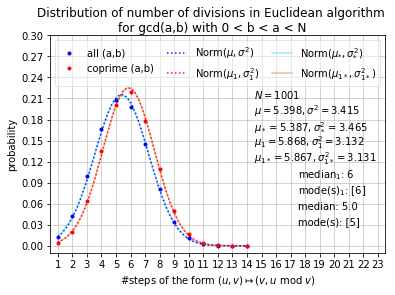
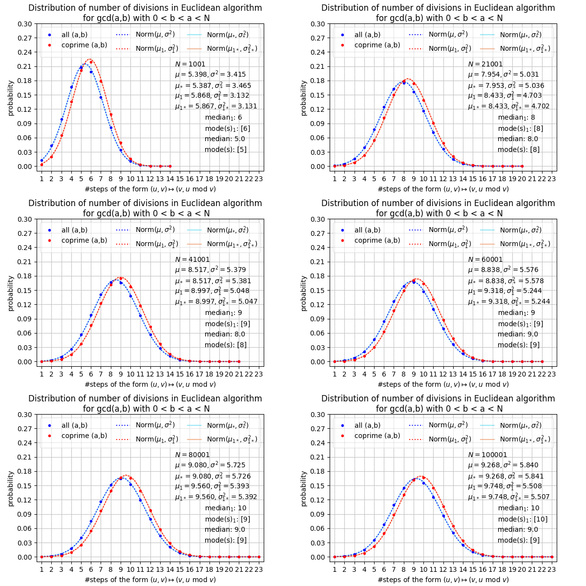
Finally, in the culmination of the above theorems and numerical data, we generate an animation showing the distribution of our random variables \(X\) and \(X_1\). Recall that \(X\) gives the value of \(T(a,b)\), for \((a,b)\) chosen uniformly at random from ordered pairs with \(1 \le b < a \le N\), and that \(X_1\) is defined similarly, but with the restriction that \(\gcd(a,b) = 1\). Below is the frame corresponding to \(N = 1000\) in our sequence running over \(N = 1000,2000,\ldots,100000\). (Well, we have written \(N = 1001\) and so on, with \(0 < b < a < N\).)
The horizontal axis shows the possible values \(s\) that \(X\) or \(X_1\) may take (over all \(N\) in our sequence). The blue and red dots show the probabilities that \(X = s\) and \(X_1 = s\), respectively, i.e.
\[
\mathbb{P}(X = s) = \frac{1}{\binom{N}{2}} \#\{1 \le b < a \le N : T(a,b) = s\} \quad \textrm{and} \quad \mathbb{P}(X_1 = s) = \frac{\#\{1 \le b < a \le N : gcd(a,b) = 1, \, T(a,b) = s\}}{\#\{1 \le b < a \le N : \gcd(a,b) = 1\}}.
\]
\[
\#\{1 \le b < a \le N : \gcd(a,b) = 1\} = \frac{N^2}{2\zeta(2)} + O(N \log N).
\]
The plot also displays the means \(\mu = \mathbb{E}[X]\) and \(\mu_1 = \mathbb{E}[X_1]\), truncated at the third decimal place. Likewise, we have \(\sigma^2 = \mathrm{Var}(X)\) and \(\sigma_1^2 = \mathrm{Var}(X_1)\). The same notation with the \(*\)-subscript stands for the estimates given for the expected values by Norton’s theorem (Theorem 6.1), i.e. \(\mu_* = \lambda \log N + \nu - \frac{1}{2}\) and \(\mu_{1*} = \lambda \log N + \nu_1 - \frac{1}{2}\), and for the variances by the theorem of Baladi and Vallée (?thm-BalVal), with our “guesstimates” for the subdominant constants (viz. \(\kappa = -0.1\) and \(\kappa_1 = -0.434\)): \(\sigma_{*}^2 = \eta \log N + \kappa\) and \(\sigma_{1*}^2 = \eta \log N + \kappa_1\).
The dotted blue curve is the PDF for the normal distribution of mean \(\mathbb{E}[X]\) and variance \(\mathrm{Var}[X]\). The solid (but pale) blue curve is the PDF of the normal distribution of mean \(\mu_*\) and variance \(\sigma^2_*\). The red curves are the same but for \(X_1\). There is no visually discernable difference between curves of the same colour. Also, the dots all lie quite close to the curves of the same colour. Indeed, the estimations given by the theorems fit the data with a striking accuracy.
We also display the mean, median, and mode of \(X\) and \(X_1\) (the subscript \(1\) corresponds to \(X_1\), naturally).
Here is the finished animation.
The frames come from plot_two_dim_distribution_frame and animate_two_dim_distribution, working from the loaded B (coprime) and C (all pairs) datasets: the empirical distributions of \(X\) and \(X_1\) as dots, dotted normal curves with the empirical means and variances, and pale solid normal curves with the theoretical parameters, the means from Norton’s theorem and the variances \(\eta\log N + \kappa\) and \(\eta\log N + \kappa_1\) with the guesstimates KAPPA_VAR\(= -0.1\) and KAPPA_VAR_COPRIME\(= -0.434\) from the constants module. The medians and modes shown in each frame are read from the summary statistics. save_gif writes the looping and non-looping GIFs, the former embedded above and in the introduction.
Source Code
# Numerical investigation & data visualisation {#sec-numerical-investigation}We will now visualise our data in various ways. For each visualisation, we explain the goal and give a sample frame from the animation in question; for the two distribution animations, we also embed the finished GIF. The code behind the figures is in the package: the calculations (error terms and curve fits) in `src/euclid_analysis/analysis.py`, and the figure and animation builders in `src/euclid_analysis/plotting.py`. We describe both as we go. (Generating the animations from the raw data takes a few minutes in some cases.)## One-dimensional analysis: distribution {#sec-1d-investigation}We now generate an animation consisting of a sequence of frames like the one below.This frame corresponds to $a = 1000$. Our animation will show 100 frames, corresponding to $a = 100, 200, \ldots, 10000$. Recall that for a given $a$, $Z$ is a random variable whose value at $b$ (chosen uniformly at random from among the totatives of $a$, i.e. from $\mathbb{Z}_a^{\times}$), is $T(a,b)$. The horizontal axis shows the possible values $s$ that $Z$ may take (over all $a$ in our sequence). The histogram shows the probability that $Z = s$, i.e.$$\mathbb{P}(Z = s) = \frac{1}{\phi(a)} \#\{b \in \mathbb{Z}_a^{\times} : T(a,b) = s\}.$$We also see the value of $\mathbb{E}[Z]$ and the estimate $\mu_* = \lambda \log a + C_P - 1$ given by Porter's theorem (@thm-porter), both truncated three places after the decimal point. As we will see, there is usually agreement between the two values up to one or two decimal places.We also show the variance $\sigma^2$ of $Z$, and a curve showing the PDF for the normal distribution with mean $\mu_*$ and variance $\sigma^2$. For most $a$ in our animation sequence, it would seem that the distribution of $Z$ is reasonably well-approximated by this normal distribution, i.e. for most $s$,$$\mathbb{P}(Z = s) = \frac{1}{\sigma \sqrt{2\pi}} \exp\left(-\frac{1}{2}\left(\frac{s - \mu_{*}}{\sigma}\right)^2\right) + \mathrm{error},$$where "error" is "small". Such a result, even if we could precisely formulate and prove it, would be somewhat otiose without a good estimate for $\sigma$.Here is the finished animation.The frames are drawn by `plot_one_dim_distribution_frame` and assembled by `animate_one_dim_distribution` in `plotting.py`, working from the loaded `H1` data: common axes are fixed across all frames so the picture does not jump around, and each frame shows the histogram of $Z$, the points $\mathbb{P}(Z = s)$, and the density of $\mathrm{Norm}(\mu_*, \sigma^2)$, with $\mu_*$ from Porter's theorem and $\sigma^2$ the empirical variance (no theoretical estimate for the variance being available). `save_gif` writes the animation to `images/`.## One-dimensional analysis: mean and error term {#sec-1d-investigation-mean}We now generate an animation consisting of a sequence of frames like the one below.This frame corresponds to $N = 1000$. Our animation will show 2000 frames, corresponding to $N = 1, 2, \ldots, 2000$. Recall that for a given $a$, $Z$ is a random variable whose value at $b$ (chosen uniformly at random from among the totatives of $a$, i.e. from $\mathbb{Z}_a^{\times}$), is $T(a,b)$. Porter's theorem (@thm-porter) gives a very precise estimate for $\mathbb{E}[Z]$, which is equivalent to$$\mathbb{E}[Z] - \left(\lambda \log a + C_P - 1\right) \ll_{\epsilon} a^{\epsilon - 1/6},$$for all $a \ge 1$ and any $\epsilon > 0$. We believe $Z$ behaves roughly like a normal random variable, and so we would expect the error term in Porter's result (i.e. the left-hand side of the above bound), to be positive for about half of all values of $a$ up to $N$, for all large $N$.Thus, if we consider the sum of the sign of the error term, i.e.$$\sum_{a = 1}^N \mathrm{sgn}\left(\mathbb{E}[Z] - \left(\lambda \log a + C_P - 1\right)\right),$$we expect this to behave like the distance from the origin in a one-dimensional random walk, after $N$ steps, where at each step, the probability of moving right is $1/2$, and the probability of moving left is $1/2$. Thus, the value of the above sum should be equal to zero for infinitely many $N$, and so on.The frame corresponding to $N$ in our animation shows $1,2,\ldots,N$ on the horizontal axis, and above each of these points it shows the value of the above sum. The animation does appear to be consistent with the random walk analogy.We also produce a second animation in relation to the error term in Porter's theorem. Recall @cnj-porter, effectively asserting that $1/6$ can be replaced by $1/2$ in the $O$-term exponent in Porter's theorem. Equivalently, for all $a \ge 1$ and any $\epsilon > 0$,$$\mathcal{E}(a) = \sum_{b \in \mathbb{Z}_a^{\times}} \left[T(a,b) - \left(\lambda \log a + C_P - 1\right)\right] \ll_{\epsilon} a^{\epsilon + 1/2}$$This is illustrated in a sequence of plots corresponding to $a \le 1,2,\ldots,2000$. Below is the frame corresponding to $a \le 650$.The horizontal axis shows $1,2,\ldots,650$, and above each point the value of $\mathcal{E}(a)$ is plotted. We also see the parabolas $y = \pm \sqrt{a}$ and $y = \pm c\sqrt{a}$, where $c$ is just large enough so that this parabola contains the graph $y = \mathcal{E}(a)$. We also note points like $a = 605$: this gives the maximum value $\mathcal{E}(a)/\sqrt{a}$ for $1 \le a \le 650$.In the data for $a$ up to $2000$, it would certainly seem that $\mathcal{E}(a)$ grows not much faster than $\sqrt{a}$.The calculations behind these two animations are in `analysis.py`. `porter_error` computes $\mathcal{E}(a)$ for a single $a$ directly from the frequency data, and `porter_error_series` assembles the whole map $\{a : \mathcal{E}(a)\}$. `sign_summary` takes that series and produces the random-walk quantities: the running counts of positive and negative signs, their proportions (the percentages shown in the corner of each frame), and the running sum $\sum_{a \le N} \mathrm{sgn}\,\mathcal{E}(a)$ that the first animation plots. For the second, `error_champions` scans $\mathcal{E}(a)/\sqrt{a}$ and records every $a$ at which the running maximum or minimum jumps; the largest record in absolute value up to a given point is the constant $c$ in the bounding parabolas $\pm c\sqrt{a}$, and it is the champions ($a = 605$ among them) that the frames label. The corresponding frames are drawn by `plot_porter_sign_sum_frame` and `plot_porter_error_frame` in `plotting.py`.## One-dimensional analysis: variance {#sec-1d-investigation-variance}We now generate an animation consisting of a sequence of frames like the one below.This frame corresponds to $N = 1000$. Our animation will show 100 frames, corresponding to $N = 100, 200, \ldots, 10000$. Recall that for a given $a$, $Z$ is a random variable whose value at $b$ (chosen uniformly at random from among the totatives of $a$, i.e. from $\mathbb{Z}_a^{\times}$), is $T(a,b)$. The variance of $Z$ is thus$$\mathrm{Var}(Z) = \mathbb{E}[Z^2] - (\mathbb{E}[Z])^2.$$Although Porter's theorem (@thm-porter) gives a very precise estimate for $\mathbb{E}[Z]$, namely$\mathbb{E}[Z] = \lambda \log a + C_P - 1 + O_{\epsilon}(a^{\epsilon - 1/6})$, a precise estimate for $\mathrm{Var}(Z)$ has not been established.We consider the second moment$$\mathbb{E}[Z^2] = \frac{1}{\phi(a)} \sum_{b \in \mathbb{Z}_a^{\times}} T(a,b)^2$$of $Z$. We suspect that this is reasonably well-approximated by $c_2(\log a)^2 + c_1 \log a + c_0$ for certain constants $c_2,c_1,c_0$.In the plot above, the horizontal axis shows $a$-values for $1 \le a \le N$, and above each such point we plot the value of $\mathbb{E}[Z^2]$. We also plot the best-fitting curve of the form $c_2(\log a)^2 + c_1 \log a + c_0$ to the data shown in the plot, and display $c_2,c_1,c_0$, truncated at the fourth decimal place.The curve certainly seems to have the right rate of growth, but $\mathbb{E}[Z^2]$ seems to oscillate quite widely around it, possibly because the $a$-values we are considering are fairly small. Notice that, in the above plot, $c_2 \approx 0.71$, and that $\lambda^2 = 0.7102543\ldots$ (see (@eq-mu_dixon)). Coincidence? We think not. In fact, by Porter's theorem we have$$(\mathbb{E}[Z])^2 \approx (\lambda\log a + C_P - 1)^2 = \lambda^2(\log a)^2 + 2\lambda(C_P - 1)\log a + (C_P - 1)^2.$$As we noted, $\lambda^2 = 0.7102543\ldots$. If we curve-fit the data for $\mathbb{E}[Z^2]$ with $\lambda^2(\log a)^2 + c_1\log a + c_0$, we get values for $c_1$ that are fairly close to $\eta + 2\lambda(C_P - 1) = 1.3033\ldots$. (See (@eq-hensley_constant) for Hensley's constant, which arises in the variance in the two-dimensional analysis.)In conclusion, we suspect that $\mathrm{Var}(Z) = \eta\log a + \mathrm{constant} + \mathrm{error}$, where $\mathrm{error} \ll_{\epsilon} a^{\epsilon - 1/2}$ (but the error term dominates $\mathrm{constant}$ for $a$ in the range we are considering here). The $\mathrm{constant}$ appears to be around $-0.3$. Below is a plot of $\mathrm{Var}(Z) - (\eta\log a - 0.354)$ for $100 \le a \le 1000$. Also, the plot shows bounding curves growing like $(\log a)^2a^{-1/2}$. We'll animate a sequence of such plots, corresponding to $100 \le a \le N$ for $N = 1000,1100,\ldots,10000$.Here the curve fitting is the point. `second_moment_model` in `analysis.py` is the ansatz $c_2(\log a)^2 + c_1\log a + c_0$, and `fit_second_moment` fits it to the empirical second moments with `scipy.optimize.curve_fit` over a chosen range of $a$; each frame of the first animation refits on the data up to its $N$ and displays the fitted $(c_2, c_1, c_0)$, and it is this fit that keeps returning $c_2 \approx 0.71 \approx \lambda^2$. For the second animation, `variance_guess_error` forms the residuals $\mathrm{Var}(Z) - (\eta\log a + \mathrm{constant})$, the constant defaulting to $-0.354293955$, the value obtained from a line of best fit done separately from this document; the bounding curves $c_{\pm}(\log a)^2/\sqrt{a}$ take $c_{\pm}$ just large enough to contain the data. The frames are drawn by `plot_second_moment_frame` and `plot_variance_error_frame`.## Two-dimensional analysis: error terms & subdominant constant in the variance {#sec-2d-investigation}We now generate an animation from a sequence of frames, one of which is shown below. Each frame contains four plots: the two plots on the left correspond to the random variable $X$, while the two on the right correspond to $X_1$. Recall that $X$ gives the value of $T(a,b)$, for $(a,b)$ chosen uniformly at random from ordered pairs with $1 \le b < a \le N$, and that $X_1$ is defined similarly, but with the restriction that $\gcd(a,b) = 1$.Norton's theorem (@thm-norton) tells us that $\mathbb{E}[X] - \lambda \log N = \nu - \frac{1}{2} + O_{\epsilon}(N^{\epsilon - 1/6})$, and, equivalently (see @prp-ExpEquiv), that $\mathbb{E}[X_1] - \lambda\log N = \nu_1 - \frac{1}{2} + O_{\epsilon}(N^{\epsilon - 1/6})$. (See (@eq-mu_dixon) and (@eq-norton_constant) for the constants.) If @cnj-porter is true, $1/6$ can be replaced by $1/2$ in the exponent of each $O$-term here. In the top two plots below, we see $\mathbb{E}[X] - \lambda\log N$ (left) and $\mathbb{E}[X_1] - \lambda \log N$ (right) for $N = 1000,2000,\ldots,100000$ (horizontal axis). We curve-fit each set of points to curves $B + C_1/\sqrt{N}$ (left) and $B_1 + C_2/\sqrt{N}$ (right). These curves certainly seem to be of the right "shape", supporting the conjecture of "square-root cancellation". Moreover, $B$ should be close to $\nu - \frac{1}{2} = -0.4346485\ldots$, and $B_1$ should be close to $\nu_1 - \frac{1}{2} = 0.0456951\ldots$. Also, $B_1 - B$ should be close to $\nu_1 - \nu = 0.4803436\ldots$, as shown in @prp-ExpEquiv. Indeed, as displayed in the plot below, $B = -0.4357\ldots$, $B_1 = 0.0457\ldots$, and $B_1 - B = 0.4803\ldots$The bottom two plots are analogous, but for the variances of $X$ and $X_1$. These are also more interesting, because we don't really know what the "subdominant" constants should be. That is, by the theorem of Baladi and Vallée (@thm-BalVal), we know that there exist constants $\kappa$ and $\kappa_1$ such that $\mathrm{Var}(X) - \eta\log N = \kappa + O(N^{-c})$ and $\mathrm{Var}(X_1) - \eta\log N = \kappa_1 + O(N^{-c})$ (where $c$ is some positive constant and $\eta$ is Hensley's constant [see (@eq-hensley_constant)]). While we don't know what $\kappa$ and $\kappa_1$ are numerically, according to our calculation, we should have $\kappa - \kappa_1 = 0.3340\ldots$ (see (@eq-deltakappa) and remarks following @thm-BalVal). We also believe that we can take $c = 1/2 - \epsilon$ here, as with the mean.Thus, in the bottom two plots, we curve-fit the set of points corresponding to $\mathrm{Var}(X) - \eta\log N$ to the curve $D + C_3/\sqrt{N}$ (left), and the set of points corresponding to $\mathrm{Var}(X_1) - \eta\log N$ to the curve $D_1 + C_4/\sqrt{N}$ (right). Once again, the data seems to support square-root cancellation, and notice that $D - D_1 = 0.3383\ldots$, in agreement up to two decimal places with our calculation for $\kappa - \kappa_1$. Encouraged by this, we suspect that the values for $D$ and $D_1$ in our animation sequence hover around the true values of $\kappa$ and $\kappa_1$ respectively. It seems that $\kappa$ may be around $-0.09$ or $-0.1$, and that $\kappa_1$ may be around $-0.43$. (We'll go with $\kappa \approx -0.1$, a nice round number, in spite of the fact that $D = -0.09\ldots$ in most of the frames in our animation.)In our animation, we start off with five points in each of the four plots, corresponding to $N = 1000, 2000,\ldots,5000$, then $N = 1000,\ldots,6000$, and so on up to $N = 1000,\ldots,100000$, as seen here. Then we proceed with $N = 2000,3000,\ldots,100000$, followed by $3000,\ldots,100000$, and so on, until $N = 96000,\ldots,100000$. The rationale behind this second sequence of plots is that the error term for smaller values of $N$ should be (and generally is) larger, so that looking at larger values of $N$ ought to give a more accurate picture. Then again, having fewer data points also gives a less accurate picture. Nevertheless, the values of $B$, $B_1$, $D$, and $D_1$ seem fairly stable throughout most of the plots in our animation.These fits are the mathematical heart of the section, and they live in `analysis.py`. `mean_variance_error_terms` builds the four error series $\mathbb{E}[X] - \lambda\log N$, $\mathbb{E}[X_1] - \lambda\log N$, $\mathrm{Var}(X) - \eta\log N$, and $\mathrm{Var}(X_1) - \eta\log N$ from the two-dimensional summary statistics, along with the differences $\mathbb{E}[X_1] - \mathbb{E}[X]$ and $\mathrm{Var}(X_1) - \mathrm{Var}(X)$. `inverse_sqrt_model` is the square-root-cancellation ansatz $C/\sqrt{N} + B$, and `fit_subdominant_constants` fits it to one error series at a time with `curve_fit`, over an optional window of checkpoints, returning the fitted pair. Applied to the two mean series it gives $(C_1, B)$ and $(C_2, B_1)$, whose limiting constants are known ($\nu - \frac{1}{2}$ and $\nu_1 - \frac{1}{2}$); applied to the two variance series it gives $(C_3, D)$ and $(C_4, D_1)$, and it is these that stand in for the unknown $\kappa$ and $\kappa_1$. The window argument is what implements the animation's two phases, a window growing to the right and then one shrinking from the left, each frame refitting over its own window. The four-panel figure above is embedded precomputed; the analysis functions reproduce its numbers from the shipped data.Reproducing the four constants directly from the shipped data (fitting over the full checkpoint range) gives the values displayed in the frame above:```{python}import euclid_analysis as eafrom euclid_analysis import dataio, analysis# Summarise the shipped two-dimensional datasets: C over all pairs, B over coprime pairs.Cstats = ea.basic_stats(dataio.load_dataset("C"))Bstats = ea.basic_stats(dataio.load_dataset("B"))# Build the error series, then fit each to C/sqrt(N) + const and keep the constant.series = analysis.mean_variance_error_terms(Cstats, Bstats)_, B = analysis.fit_subdominant_constants(series["err_mean"])_, B1 = analysis.fit_subdominant_constants(series["err_mean1"])_, D = analysis.fit_subdominant_constants(series["err_var"])_, D1 = analysis.fit_subdominant_constants(series["err_var1"])print(f"B (mean, all pairs) = {B:+.4f}")print(f"B_1 (mean, coprime) = {B1:+.4f}")print(f"D (variance, all pairs) = {D:+.4f}")print(f"D_1 (variance, coprime) = {D1:+.4f}")print(f"B_1 - B = {B1 - B:+.4f} (cf. nu_1 - nu = 0.4803)")print(f"D - D_1 = {D - D1:+.4f} (cf. kappa - kappa_1 = 0.3340)")```## Two-dimensional analysis: distribution {#sec-2d-distribution}Finally, in the culmination of the above theorems and numerical data, we generate an animation showing the distribution of our random variables $X$ and $X_1$. Recall that $X$ gives the value of $T(a,b)$, for $(a,b)$ chosen uniformly at random from ordered pairs with $1 \le b < a \le N$, and that $X_1$ is defined similarly, but with the restriction that $\gcd(a,b) = 1$. Below is the frame corresponding to $N = 1000$ in our sequence running over $N = 1000,2000,\ldots,100000$. (Well, we have written $N = 1001$ and so on, with $0 < b < a < N$.)The horizontal axis shows the possible values $s$ that $X$ or $X_1$ may take (over all $N$ in our sequence). The blue and red dots show the probabilities that $X = s$ and $X_1 = s$, respectively, i.e.$$\mathbb{P}(X = s) = \frac{1}{\binom{N}{2}} \#\{1 \le b < a \le N : T(a,b) = s\} \quad \textrm{and} \quad \mathbb{P}(X_1 = s) = \frac{\#\{1 \le b < a \le N : gcd(a,b) = 1, \, T(a,b) = s\}}{\#\{1 \le b < a \le N : \gcd(a,b) = 1\}}.$$Note that in view of (@eq-mertens),$$\#\{1 \le b < a \le N : \gcd(a,b) = 1\} = \frac{N^2}{2\zeta(2)} + O(N \log N).$$The plot also displays the means $\mu = \mathbb{E}[X]$ and $\mu_1 = \mathbb{E}[X_1]$, truncated at the third decimal place. Likewise, we have $\sigma^2 = \mathrm{Var}(X)$ and $\sigma_1^2 = \mathrm{Var}(X_1)$. The same notation with the $*$-subscript stands for the estimates given for the expected values by Norton's theorem (@thm-norton), i.e. $\mu_* = \lambda \log N + \nu - \frac{1}{2}$ and $\mu_{1*} = \lambda \log N + \nu_1 - \frac{1}{2}$, and for the variances by the theorem of Baladi and Vallée (@thm-BalVal), with our "guesstimates" for the subdominant constants (viz. $\kappa = -0.1$ and $\kappa_1 = -0.434$): $\sigma_{*}^2 = \eta \log N + \kappa$ and $\sigma_{1*}^2 = \eta \log N + \kappa_1$.The dotted blue curve is the PDF for the normal distribution of mean $\mathbb{E}[X]$ and variance $\mathrm{Var}[X]$. The solid (but pale) blue curve is the PDF of the normal distribution of mean $\mu_*$ and variance $\sigma^2_*$. The red curves are the same but for $X_1$. There is no visually discernable difference between curves of the same colour. Also, the dots all lie quite close to the curves of the same colour. Indeed, the estimations given by the theorems fit the data with a striking accuracy.We also display the mean, median, and mode of $X$ and $X_1$ (the subscript $1$ corresponds to $X_1$, naturally).Here is the finished animation.The frames come from `plot_two_dim_distribution_frame` and `animate_two_dim_distribution`, working from the loaded `B` (coprime) and `C` (all pairs) datasets: the empirical distributions of $X$ and $X_1$ as dots, dotted normal curves with the empirical means and variances, and pale solid normal curves with the theoretical parameters, the means from Norton's theorem and the variances $\eta\log N + \kappa$ and $\eta\log N + \kappa_1$ with the guesstimates `KAPPA_VAR` $= -0.1$ and `KAPPA_VAR_COPRIME` $= -0.434$ from the constants module. The medians and modes shown in each frame are read from the summary statistics. `save_gif` writes the looping and non-looping GIFs, the former embedded above and in the introduction.